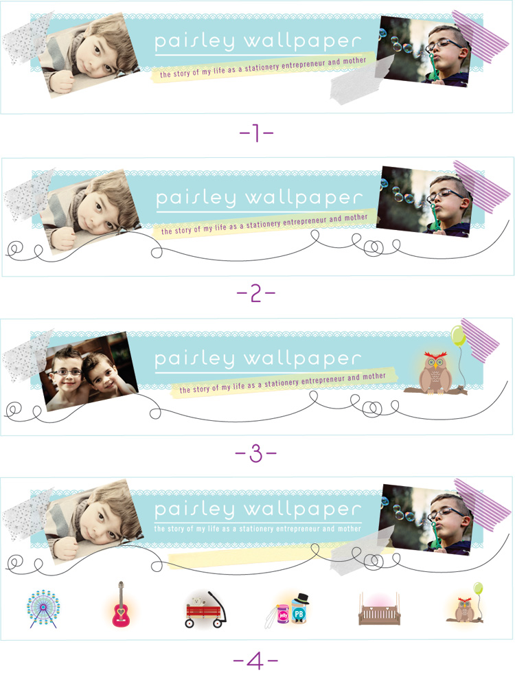
as you may have noticed, i've been playing with my header over the past couple day and would love your help deciding which direction to take. (i changed it back to the old one during the poll so as not to influence anyone's vote). i'd like it to be immediately apparent to people who stop by my blog for the first time, just what my blog is about, with a quick glance at my header.
i'd like it to include something that reflects both family and my work. the photos of the boys are obvious additions for family. the pattern on the blue bar is a pattern from my fin+roe brand. in some of the headers i have an option of either one of my marzipan illustrations or multiple illustrations.
once the header is decided on, i'd like to alter some of the other items on my blog to coincide with the new theme. so, that will all come as well....
with that said, i'd love it if you'd take a minute to vote for your favorite header option below. if you have additional comments, feel free to add them in the comment section! i'd love to hear what you have to say. i'll leave the poll up until this coming friday, the 23rd.


8 comments:
3 :)
they're all cute, Lori -- voted for #2, but see that #3 is in the lead. :D
loved how you changed the colors to the tape strips -- in fact, this is the subject of my my next tutorial.
also, thanks for the link love in your side bar, Lori! :)
I love the 3rd header, but another idea for header 4 is if you could make them look sort of like trinkets hanging from the loop. I love the two separate photos of the boys, but the graphics seem disconnected from it that way. I LOVE the loop and the tape holding the photos. Looks great!
I like number two best. It seems really well balanced. It's the one that jumped out to me.
Kat
I like #3 but with the photos switched sides (so the photos follow the tag line "stationery entreprenuer ...." from left to right). I love the bubble blowing picture!
I prefer number 3. I agree with Julie... try switching the side photos so they read along with the tag line. Lovely! :)
i really like them all but I voted for #2. I like how you used the tape strips in #2 along with personal photos. looks great :)
Post a Comment